Hey there, Ghost Hunters!
Welcome back to another installment of our Weekly Updates.
This week, we are previewing UI changes that the team has been implementing over the last few weeks.
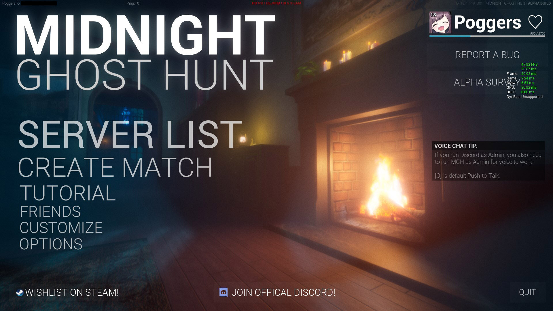
You may recognize our old main menu design if you’ve played in any of our alpha tests. Kite designed this early on in the project and has wanted to revamp it for many months now.
One of the problems with the old design was that it was quite GPU intensive. It was a live render of a portion of the Mansion map, complete with dynamic moonlight shadows and a fireplace. This caused some fairly poor performance on lower end hardware.
Kite spent some time over the holiday break redesigning the UI:
(Click the gif above to view at high quality, Gfycat embeds are standard definition)
On the left hand side of the menu is the navigation pane. Clicking one of the options will transition the page up or down. We’ve also added a live render of a hunter on the side - this will eventually show your equipped skin, maybe play some emotes, or switch to a Ghost.
Here’s a look at the new find/create servers section:
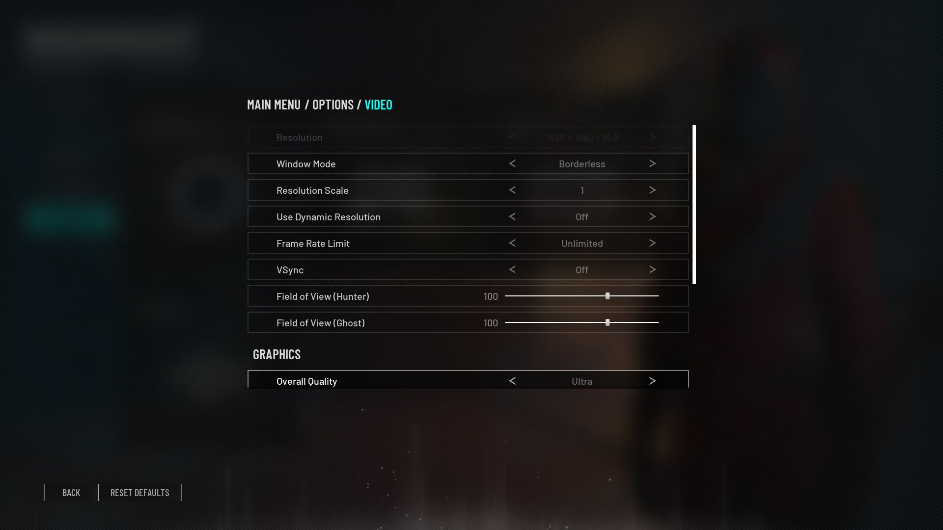
A player may want to jump straight into video settings after launching the game. We’ve made that a bit easier and cleaner.
There’s much more to come! Please let us know what you think, we’d really love some feedback on the new direction we’ve taken.
Join our Discord: https://discord.gg/midnightghosthunt
Follow us on Twitter: https://www.twitter.com/NightGhostHunt
Like us on Facebook: https://facebook.com/NightGhostHunt
Join us the conversation on Reddit: https://reddit.com/r/MidnightGhostHunt


